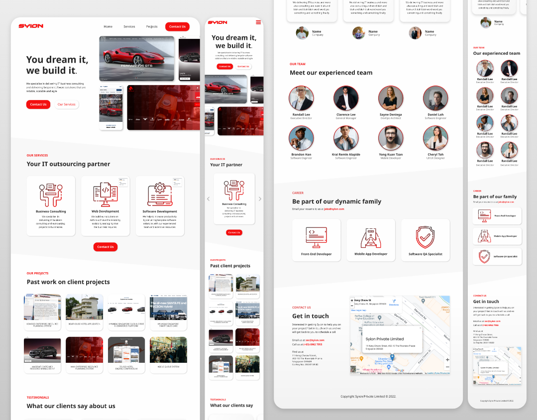
Syion reached out to us to redesign their website. Below is a brief look into the new design we came up with for Syion.

When we did a brand audit of the Syion.com website, the company colors immediately stood out: red, white, and grey. We stuck to that and used the same color scheme in the branding of their new site.
But before all that was possible, there was a quick initial call for us to understand what was needed by the client. After the call, we conducted some market research and came up with a very rough plan for the components of the website.
We put our ideas and low-fi diagrams into a deck to prepare for the next consultation. This was then presented to the team on Zoom. We took note of the feedback from the team – such as their preferring a one-page design – and got to work on the hi-fi prototype.
We were able to get the design done in a week. This was possible due to the fact that we didn’t have to conduct user research or user testing for this particular project. The tests were mostly done internally where we made sure that the UI elements made sense and adhered to industry standards.
Finally, the design was complete – you can view the full-page designs below. We have also designed the mobile variation of the website so that the team can optimize the website for mobile devices.


